Rapid prototyping to propose a modernized State of Colorado website
CO.gov | 2025 | 2 days
Team: 1 UX designers, 1 UX researcher
Role(s): Designer
Tools: Figma
Problem
The State of Colorado’s website was out of date and does not display the most important information on the page
Many citizens find that the website is poorly organized and they don’t know which information is most relevant to their situation
Our consulting company was already doing work for this client and they asked us to propose a new, modern design within a few days to pitch to stakeholders
Solution & Outcome
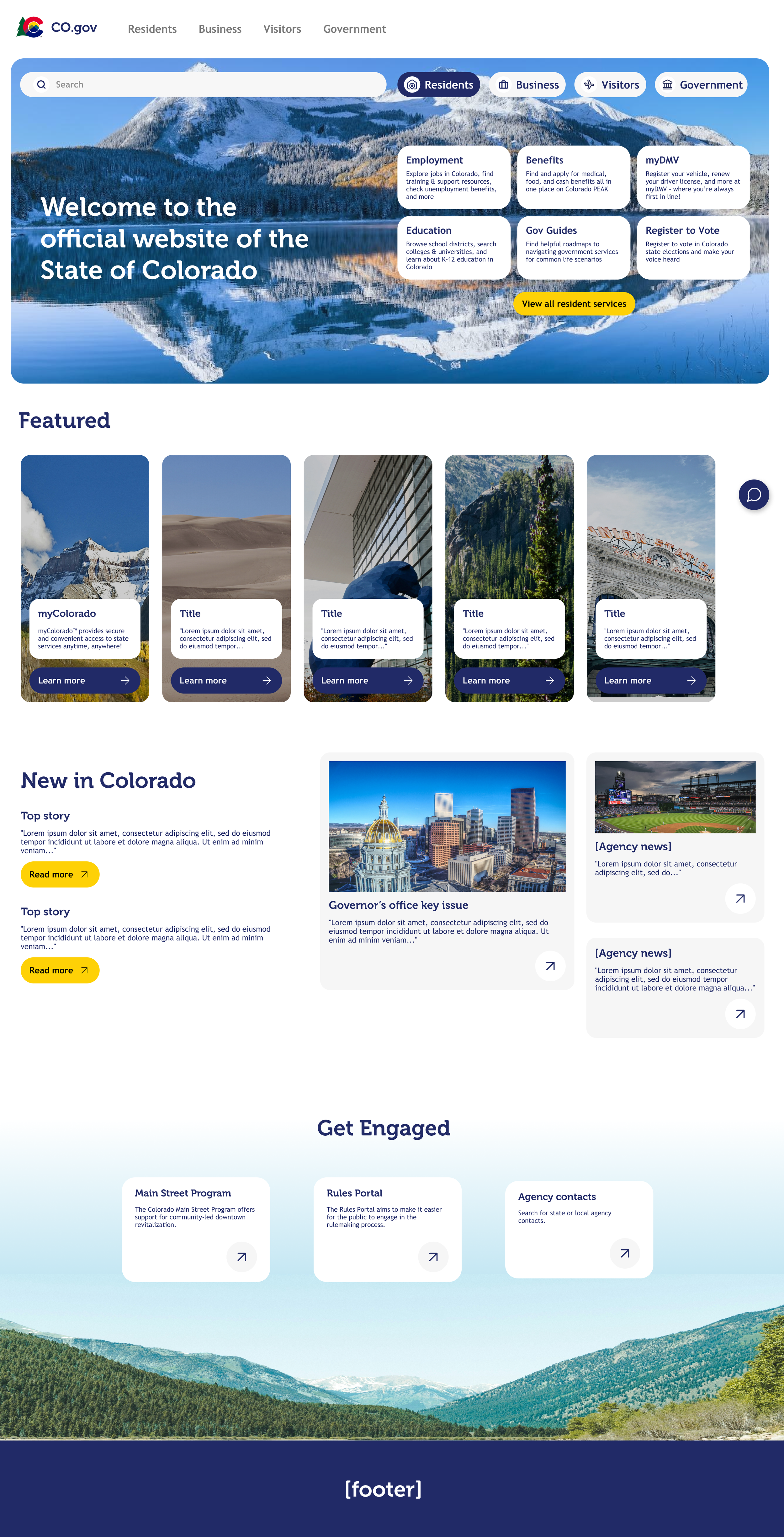
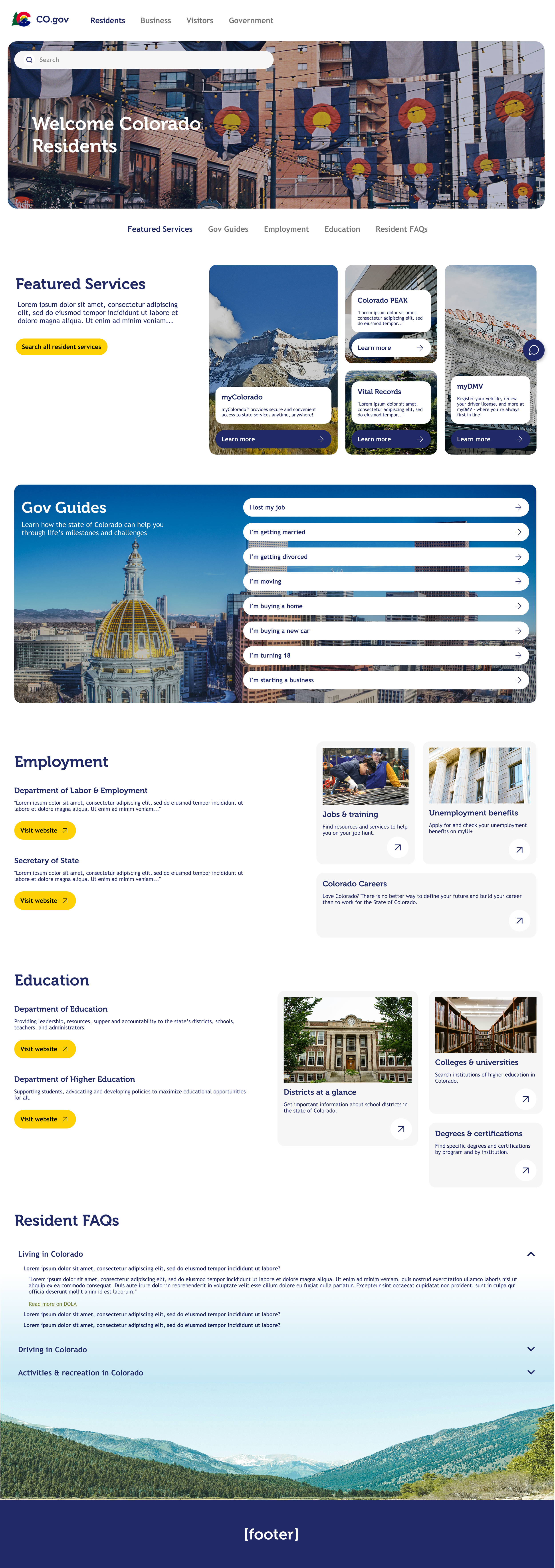
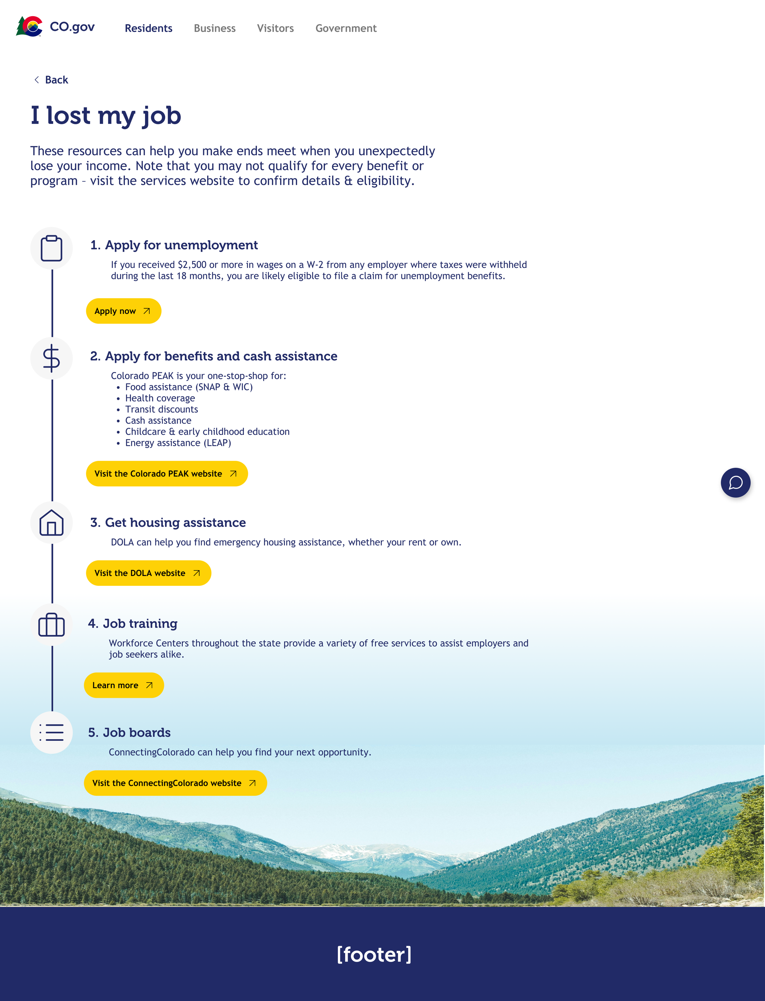
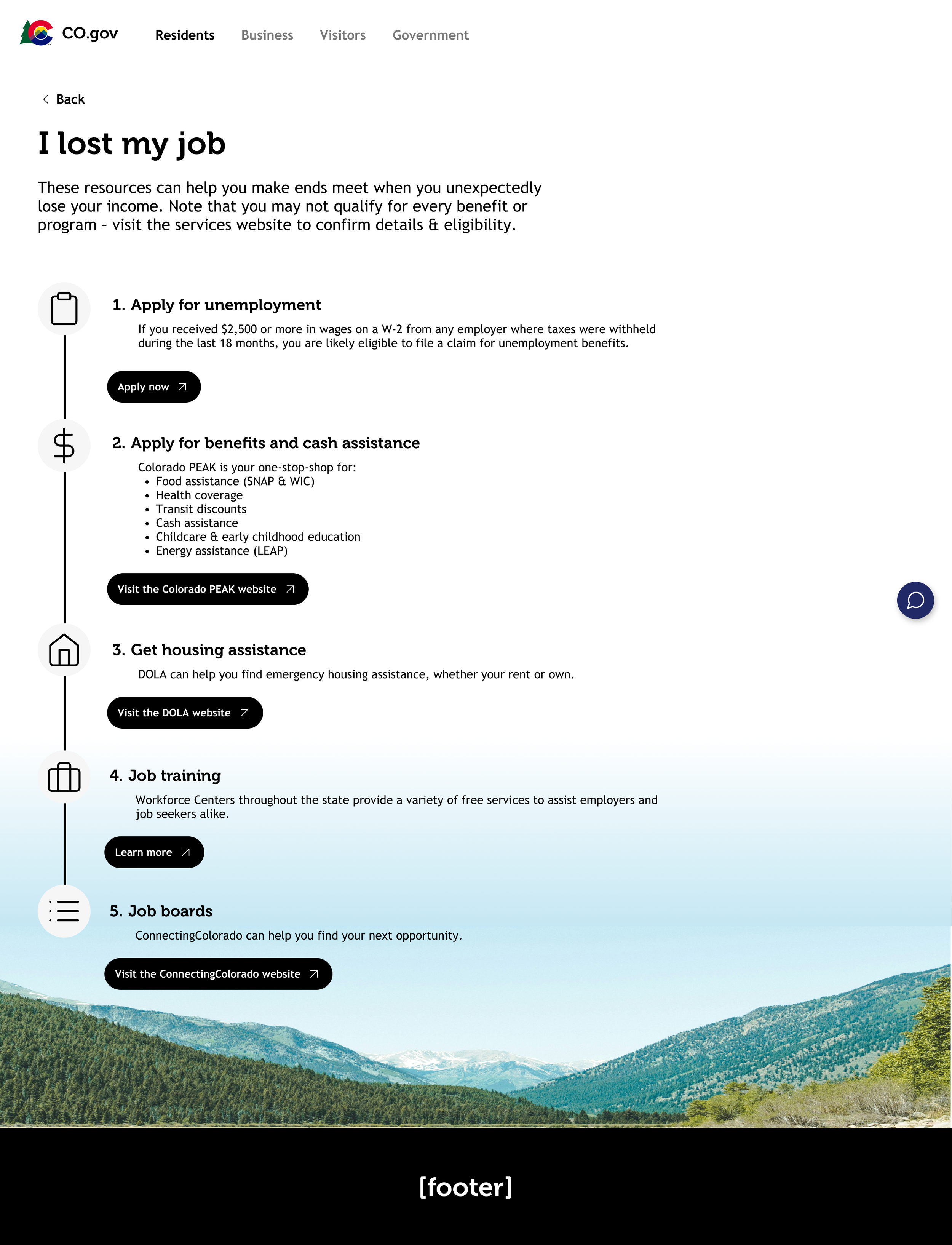
I created a prototype of a modernized state government website that included key information upfront
The website is organized by user type- Resident, Business, Visitors, Government
A high-fidelity prototype was pitched to the client and was sold to stakeholders, resulting in more paid work for my team
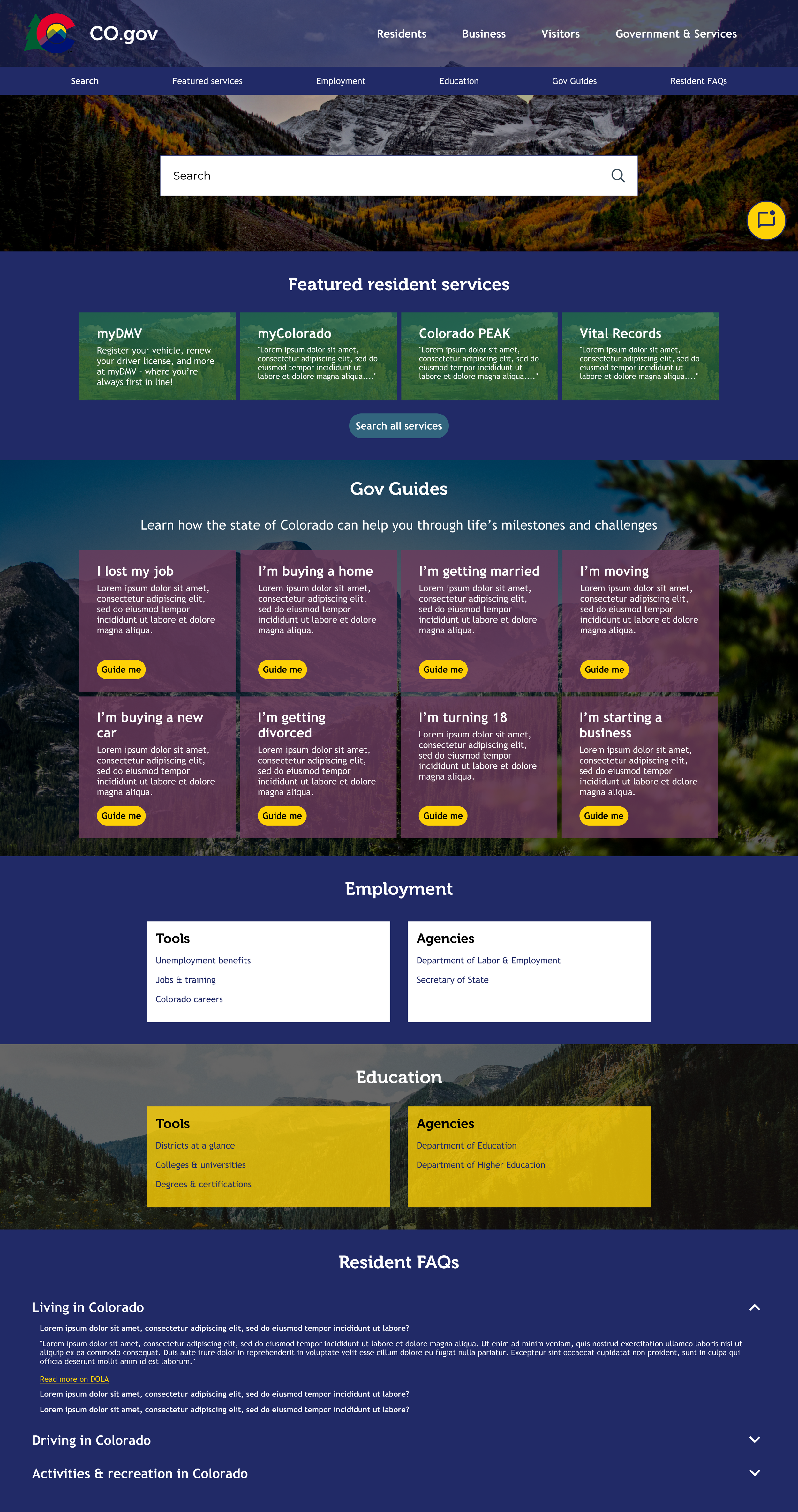
First Iteration
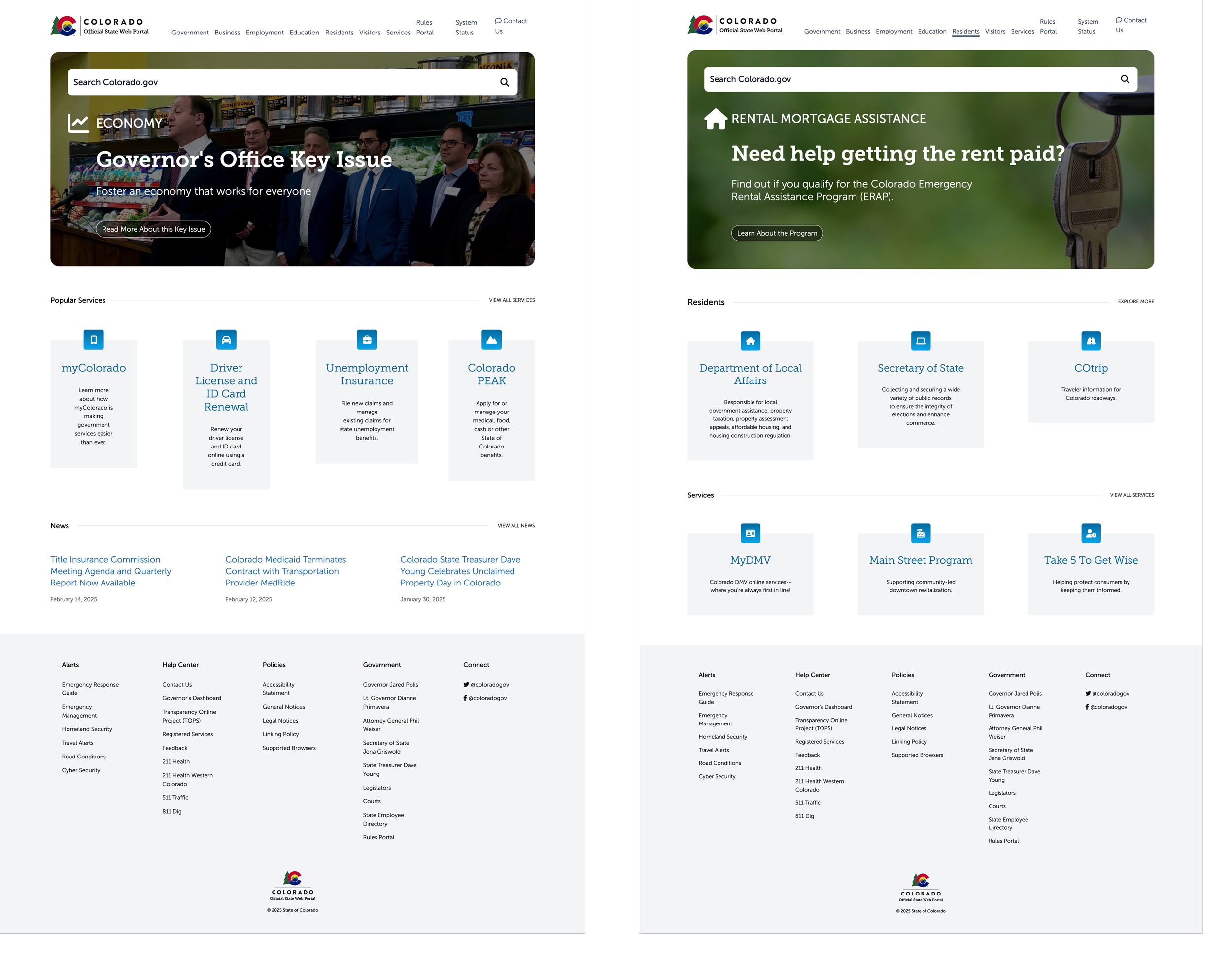
Current State
The current site is out of date and does not display the most important information on the page, links are hard to navigate and citizens struggle to find key things they need on their state’s website.
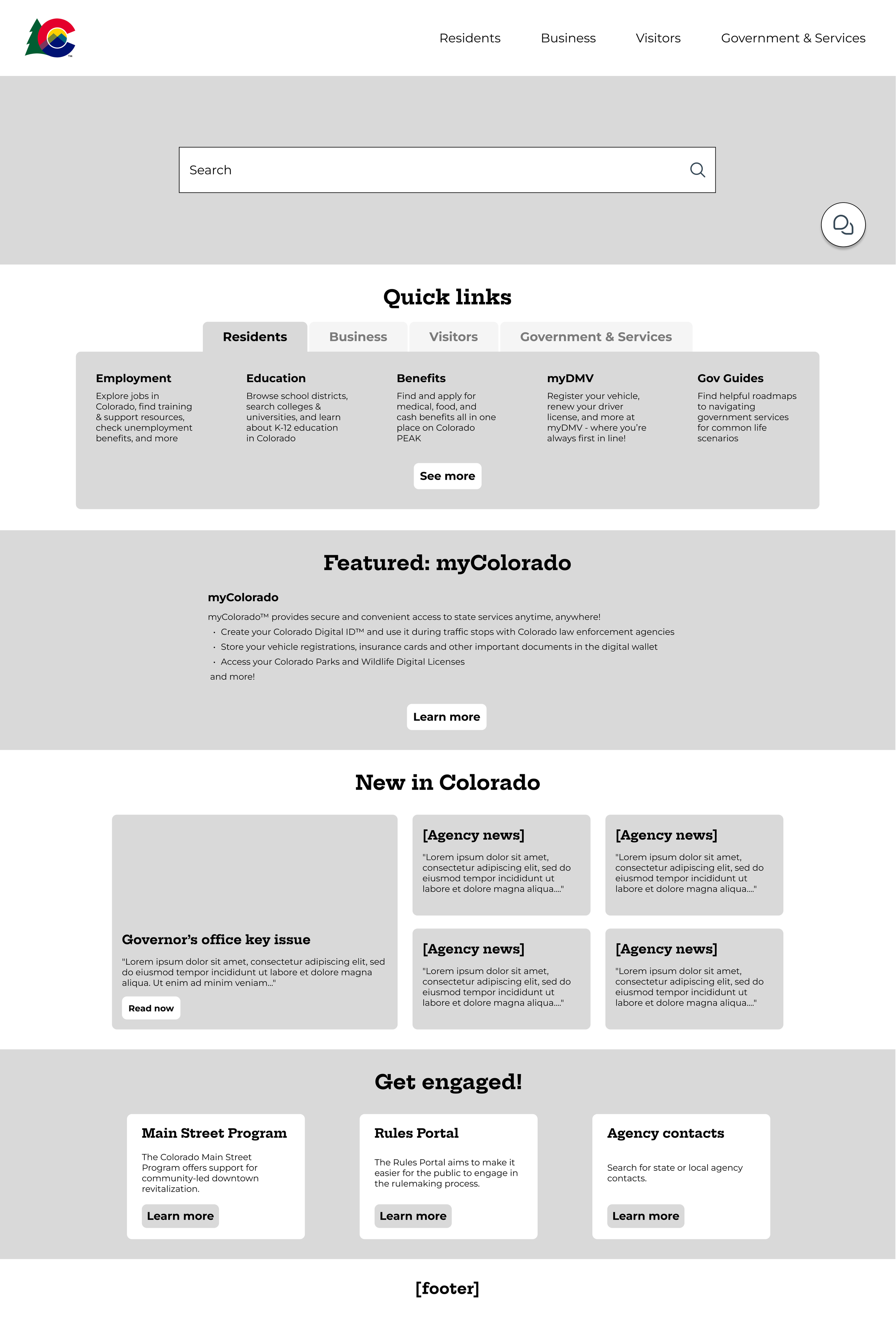
Low-fidelity Wireframes
Initial wireframes for the updated site explored the idea of more information on the landing page, sorted into key categories like “Quick Links”, “Featured”, “News” and more. This was largely inspired by a competitive audit conducted by a fellow designer that focused on other government website layouts and information.
Stakeholders liked this approach, and high-fidelity designs were created.
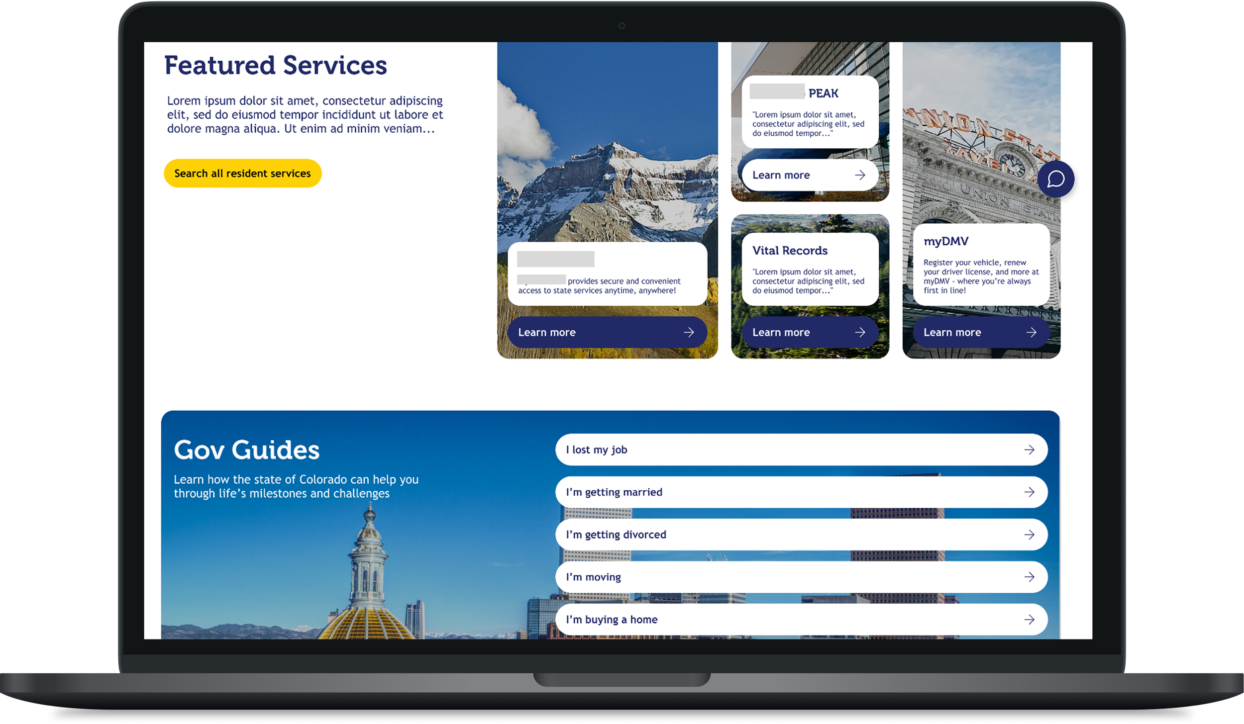
High Fidelity Designs
First Iteration
The first iteration closely followed the structure of the lo-fi wireframes and stuck to using brand colors.
Key feedback:
Too boxy and dark
Don’t need to use brand colors
Go outside the box of the wireframes, only use them as a content guide
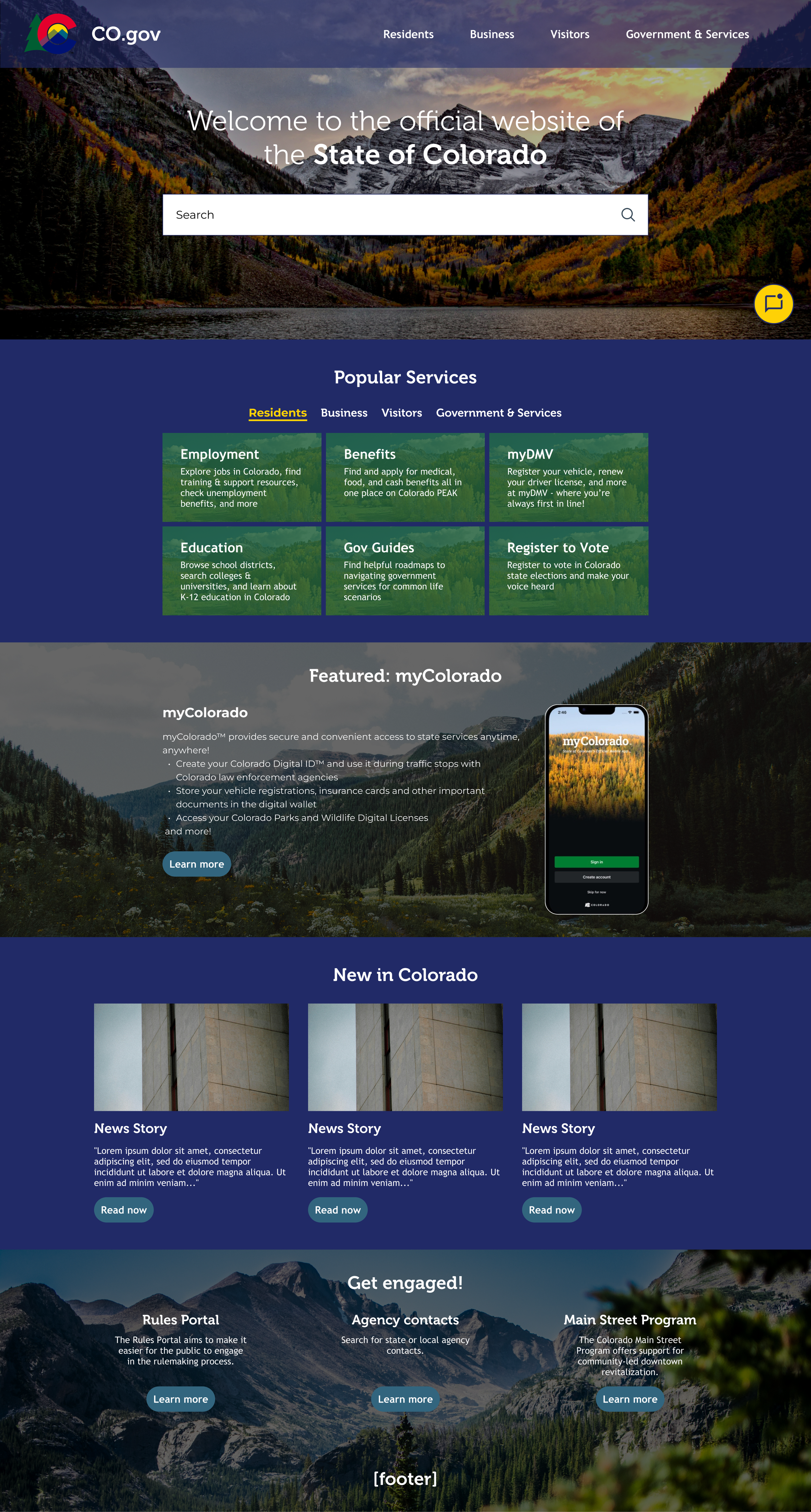
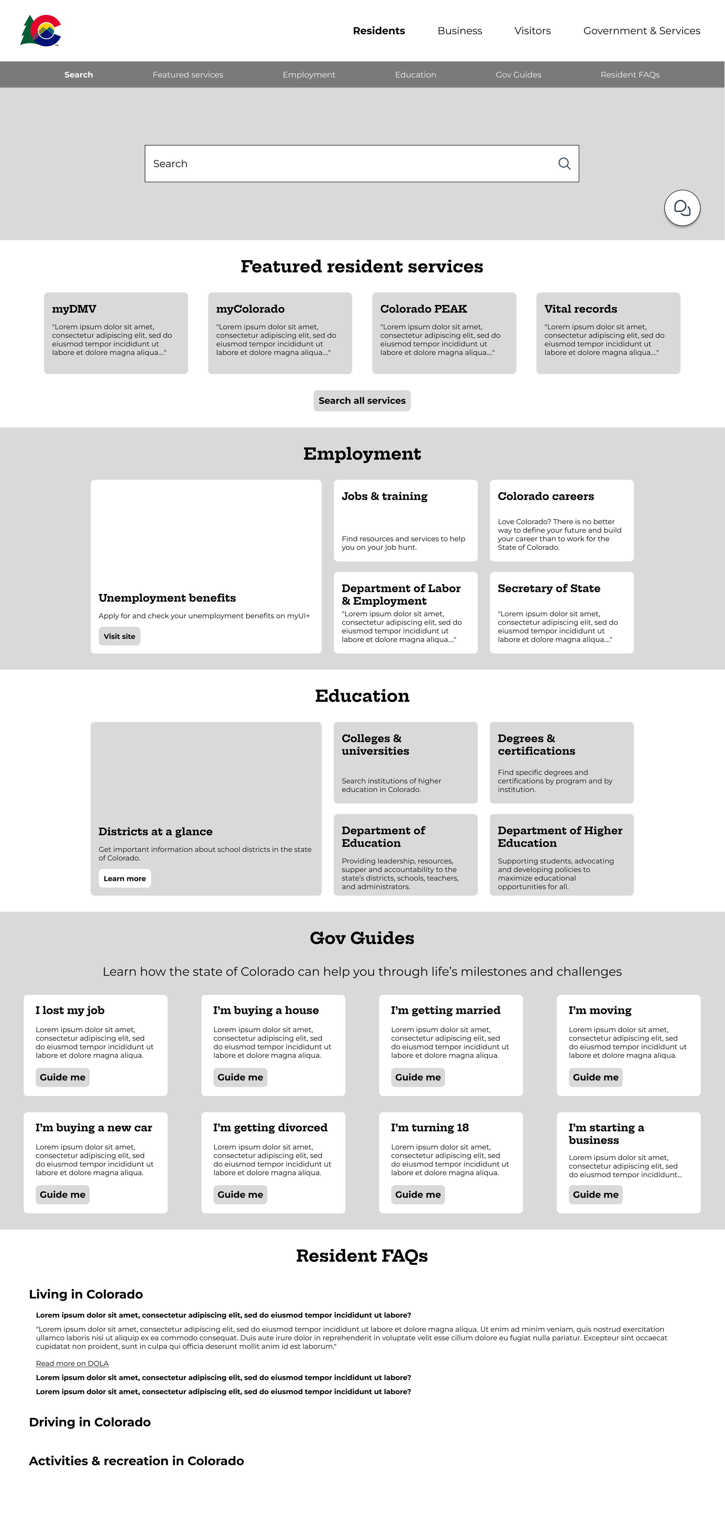
Second Iteration
I went back to the drawing board and created a completely new concept.
Key changes:
Removed brand colors
Rounded edges
Interactive section at the top of the page that allows the user to select their user type and the content below dynamically changes.
There was no significant feedback at this stage, but since I had time I made a few more adjustments.
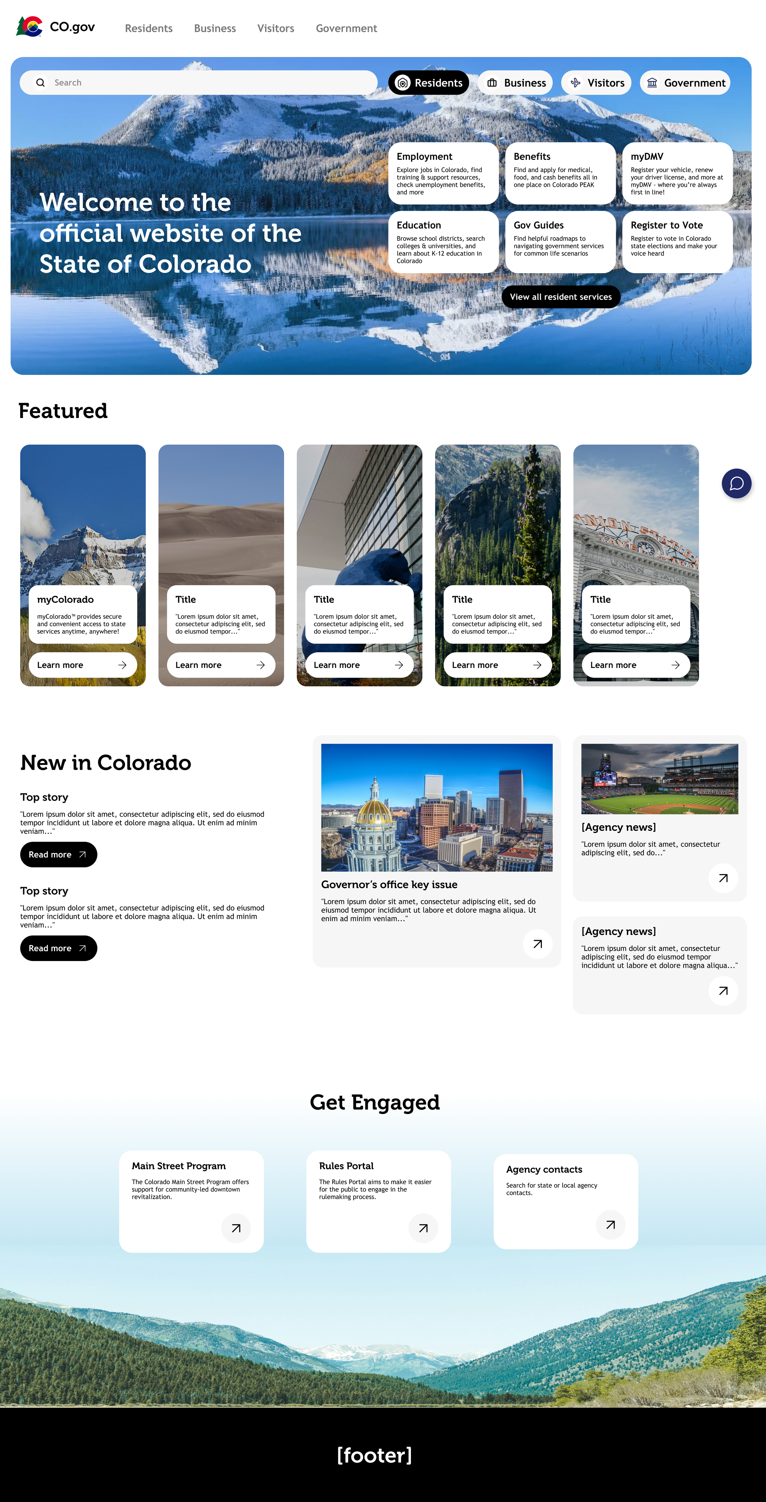
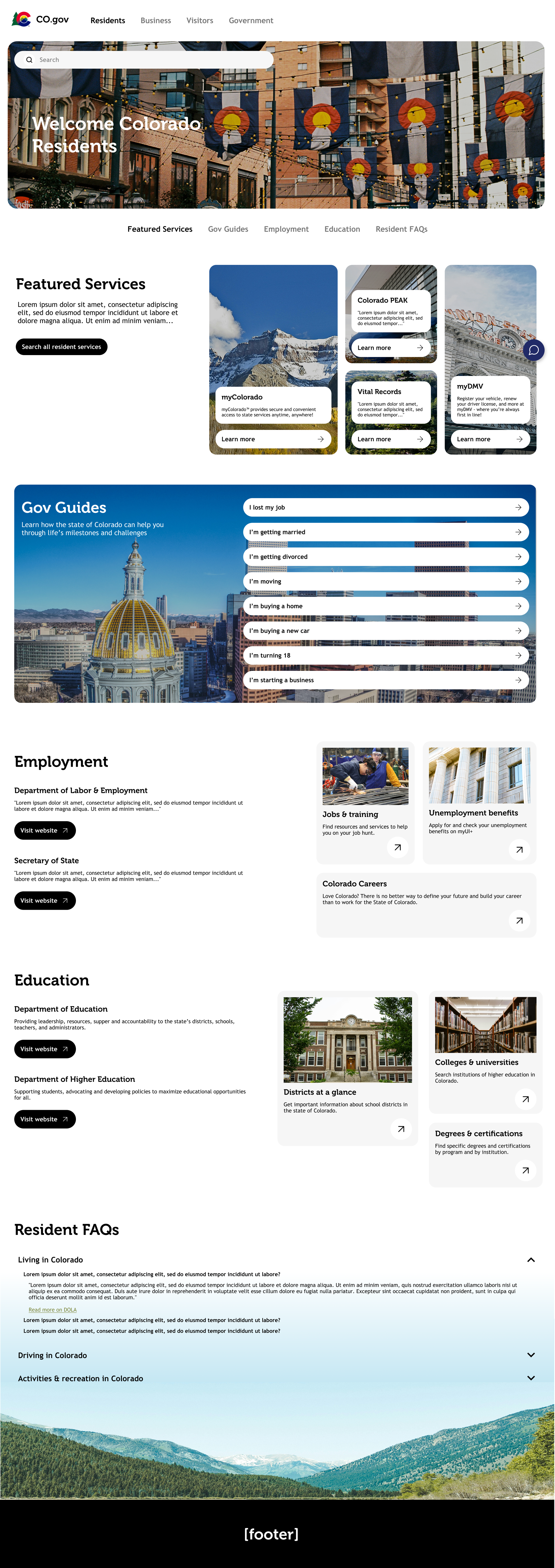
Final Iteration
For the final wireframes, I added back in the brand colors in a more subtle way, giving more life to the designs and making the site feel a little more “Colorado.” I also created a prototype which is linked below.